
Stoke: Skater Translator

Project Overview
A playful mobile app concept that translates skateboarding slang, making the culture more accessible and engaging for beginners, curious observers, and those with skaters in their lives, like partners or parents.
Role
UX/UI Designer, Brand Designer, Researcher, Copywriter
Tools
Figma, Illustrator, User Testing
Project Timeline
April-May, 2025
The Prototype
Get a feel for Stoke, the Skater Translator app.
Click through the screens directly within the widget or click the link below to explore the app for yourself. No need to be a pro, just tap around and have fun!
Key Features
Real-Time Translation: Users can speak, type, or write to get instant translations with tone and usage examples.
Glossary: Users can search or scroll the glossary for a specific skate term, trick or pro, to find its definition, cultural context, and even watch a video where applicable.
Suggested Replies: Users can choose from a list of skater-approved replies based on their mood. Whether they are stoked, confused, roasting, or just playing it cool, they can get a custom reply that meets the moment.
Trick and Skater Detection: When the user drops a trick or pro skater’s name, the app catches it. Users can tap in to explore the trick or learn the pro skater’s relevance.
The Process
Identify the Challenge
Skateboarding is a vibrant subculture with its own distinct language. But for newcomers, and even friends or family of skaters, the slang can feel confusing or alienating. The challenge was to make skate lingo more understandable and approachable without diluting the authenticity or spirit of skate culture.
Identify a Solution
Stoke: The Skater Translator
To break down the barriers of skateboarding lingo and make the culture more welcoming, I created Stoke, a mobile app designed to translate skater slang in real time, while also educating users in a fun, approachable way via a mobile app interface.
Research and Define Users
More On User Personas Here
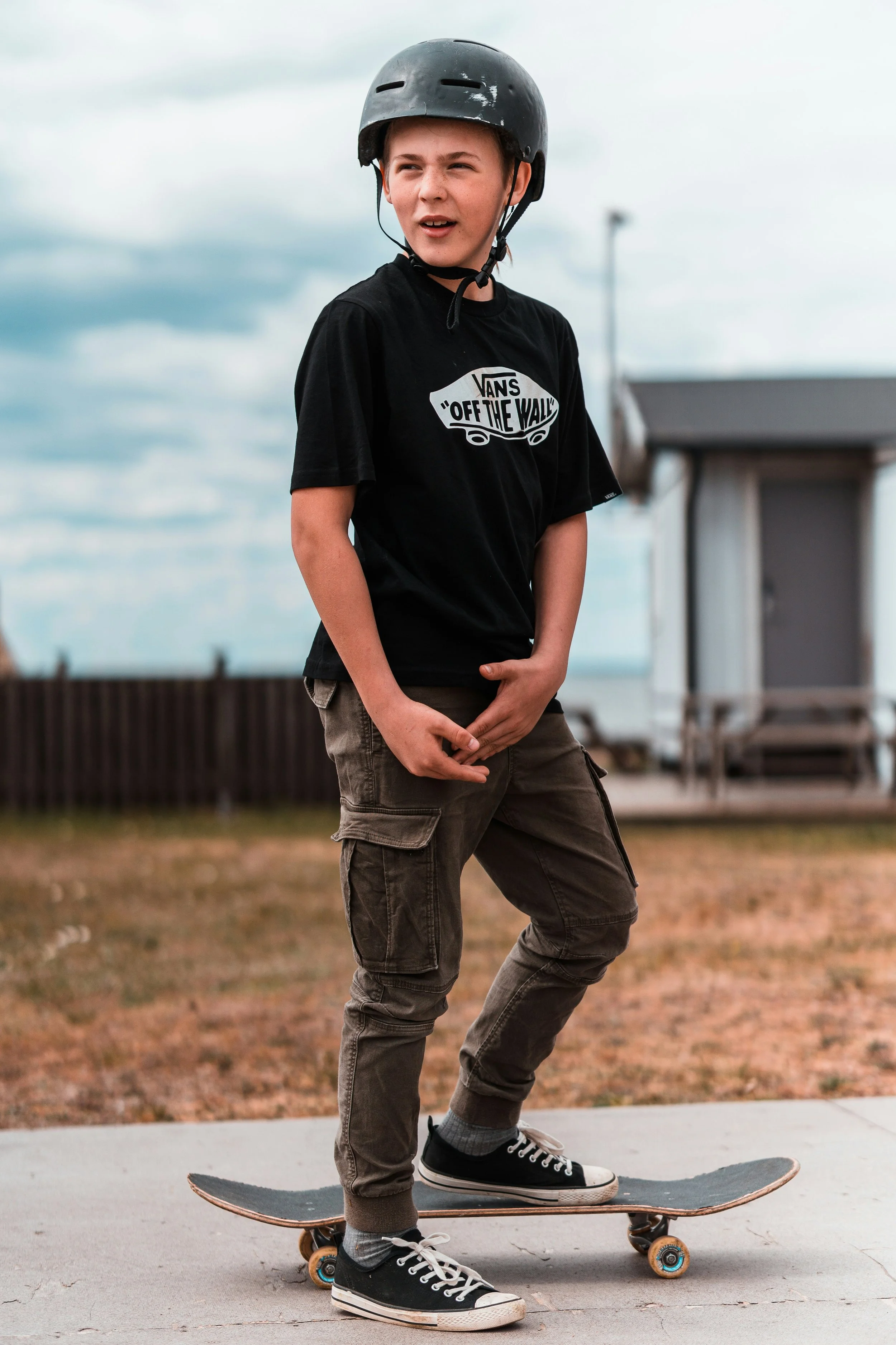
The Supportive Partner: A non-skater who’s deeply invested in skate culture through their relationship with a skater and wants to feel more included in conversations.
The Confused Parent: A well-meaning parent who wants to better understand their child’s skateboarding passion and connect more meaningfully through the language of skate culture.
The Baby Skater: A new or aspiring skater eager to learn the lingo and immerse themselves in the culture without feeling overwhelmed or out of place.
Develop a Brand Identity
Started with audience insights to ensure the identity resonated with both insiders (skaters) and outsiders (partners, beginners, and parents).
Drew inspiration from skate culture aesthetics, blending bold typography, and irreverent humor to reflect the community’s expressive spirit.
Created a playful visual system that mirrors the DIY, sticker-covered, zine-like energy of skateboarding.
Chose a bright, high-contrast color palette to signal energy and movement, while avoiding clichés often associated with extreme sports branding.
Crafted a tone of voice that’s cheeky and casual, using slang respectfully while guiding users through learning with humor and context.
Designed flexible brand elements that could be used across app UI, social media, and merch, ensuring consistency while allowing for creative expression.
User Personas
To better understand the needs and motivations of potential users, I developed three primary personas that represent key audiences for the Stoke app.

The Supportive Partner
20–40, non-skater with a close relationship to someone who skates
Goals & Motivations:
To better understand skateboarding terminology and tricks to feel more included in conversations.
To strengthen their connection with their skater partner by engaging more authentically.
To occasionally impress with a well-timed, culturally accurate comment or reply.
Challenges:
Skate terminology feels opaque and exclusive.
They often resort to pretending to understand, which can feel isolating.
They want a learning tool that is casual, entertaining, and respectful of skate culture.

The Confused Parent
35–60, non-skating parent of a skater (often a tween or teen)
Goals & Motivations:
To become more knowledgeable about skateboarding lingo in order to connect meaningfully with their child.
To confidently navigate conversations and show genuine interest in their child’s hobby.
Challenges:
Skate slang often feels indecipherable and overwhelming.
They want to avoid embarrassing missteps or appearing out-of-touch.
They’re seeking an approachable, beginner-friendly tool that doesn’t talk down to them.
The Baby Skater
10–18, beginner or early-stage skateboarder
Goals & Motivations:
To learn and use skate slang correctly in order to feel accepted and confident within the skate community.
To better understand content shared by peers and pro skaters online.
Challenges:
Skate culture can feel like an inside joke they’re not fully in on.
They’re unsure where to go to learn the language without feeling judged or called out.
They need a tool that’s fun, fast, and doesn’t feel like “school.”
User Tasks
With the personas in mind, I identified core user tasks to guide the app’s functionality and ensure it meets the needs of both skate-savvy and skate-new audiences.
Translate a Word or Phrase
The user inputs a confusing skate-related phrase they just heard and receives an easy-to-understand translation, along with optional suggested replies based on their selected mood or persona.
Look Up a Term in the Glossary
The user searches for a specific skate term (like “tre flip”) in the glossary to learn what it means, how it’s used, and why it matters in skating culture.
Check Notifications & Phrase of the Day
The user views their notifications, explores the “Phrase of the Day,” and clears or saves it for later. They may tap on it to learn the meaning, see how it’s used, and optionally share or react to it.
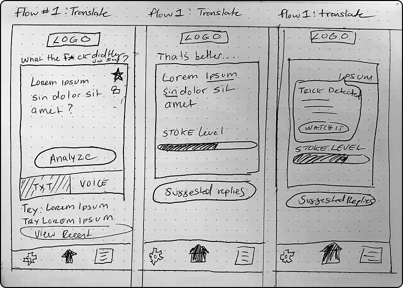
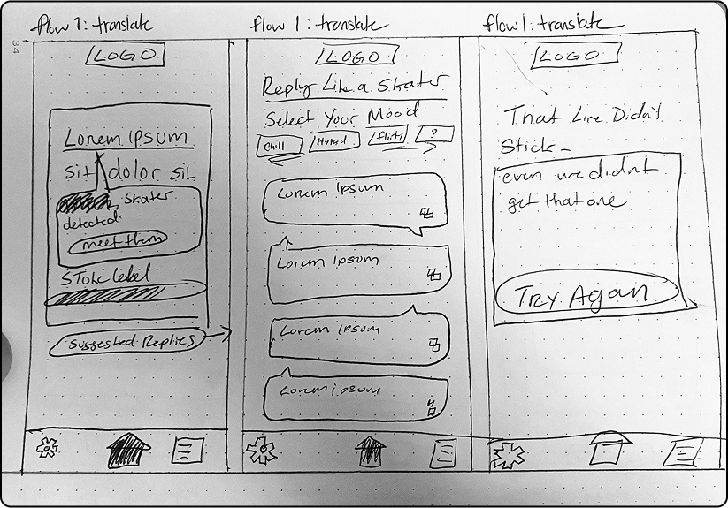
Wireframes
I began with low-fidelity wireframes to map out the core user flows and ensure a clear, intuitive experience before moving into visual design.

App Screens
The final app screens bring the concept to life with playful visuals, engaging interactions, and features aligned with user needs uncovered during research.
Scroll left and right to explore screens for various user tasks.

User Task: Translate a Word or Phrase via Text Input
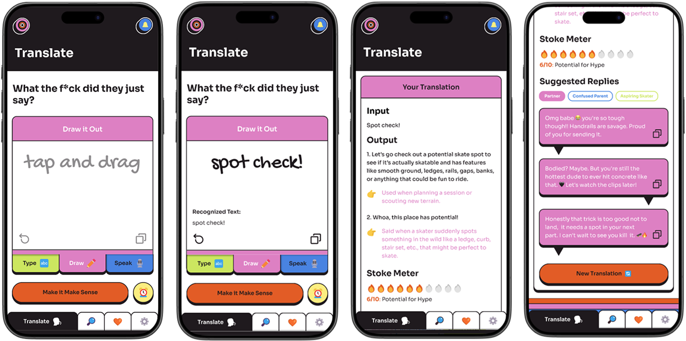
User Task: Translate a Word or Phrase via Drawn Input
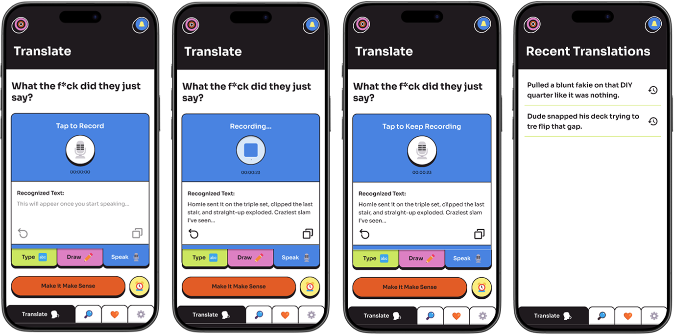
User Task: Translate a Word or Phrase via Speech Input
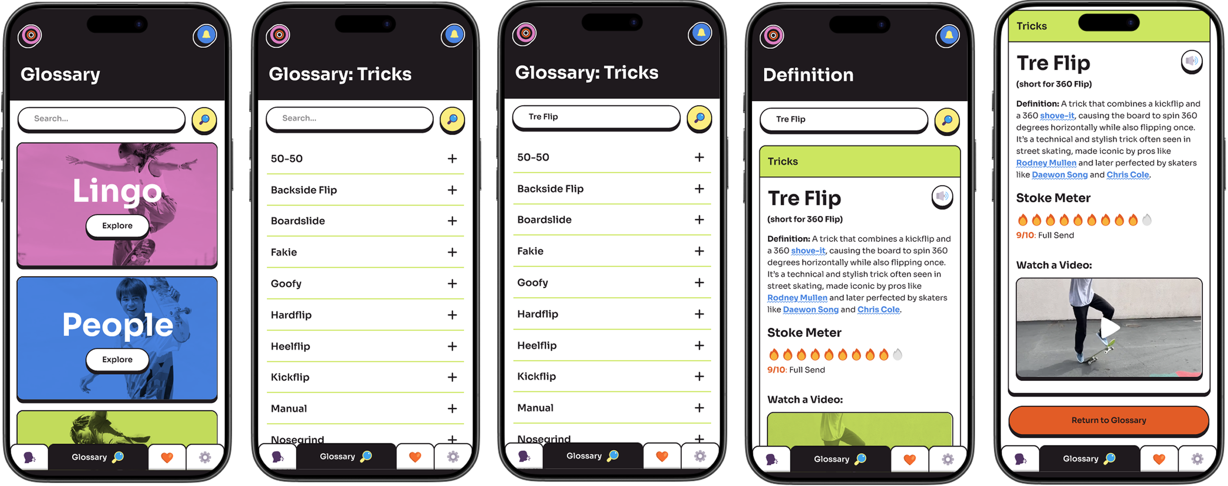
User Task: Look Up a Trick in the Glossary
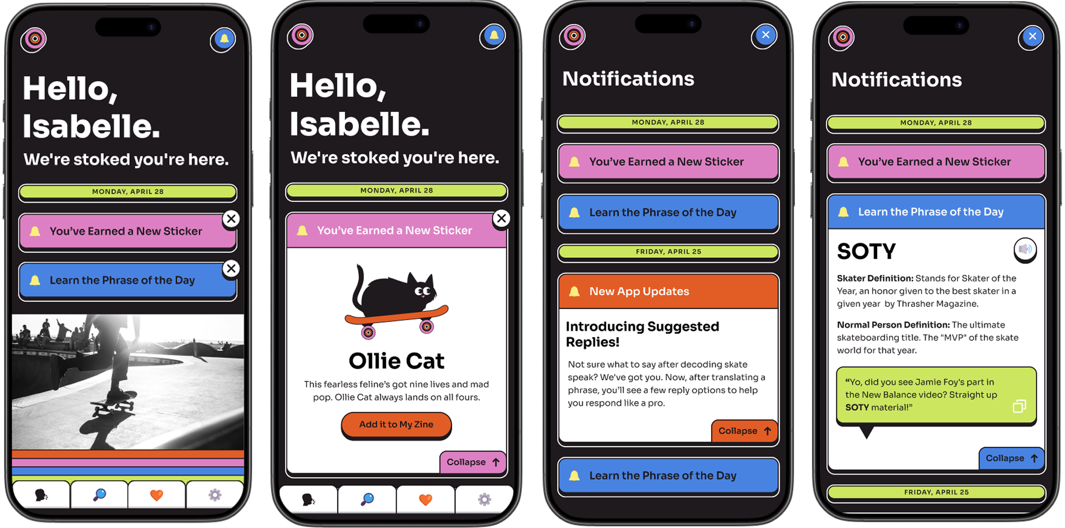
User Task: Check Notifications and Phrase of the Day
User Feedback
To evaluate the app’s usability and concept clarity, I conducted remote testing through UserTesting.com. Feedback was collected from three male participants ranging in age from their 20s to 40s, representing a mix of skate-familiar and skate-new users.
Ease of Use
4.67/5
All users completed tasks successfully
Described the app as "easy to navigate" and "intuitive."
Likelihood to Recommend
4.67/5
Translator, Glossary, and Phrase of the Day were favorites
Multimodal input (text, draw, speak) was positively noted.
Tone was received as playful and fun
Overall Look & Feel
2.33/5
“Childish” or “Unpolished”
“Inconsistent with expectations for a translator app
Two users noted that tone and branding felt at odds with the purpose and did not think this app would be taken seriously.
Suggestions for Improvement
Adopt more standard iconography
Improve layout clarity on the homepage.
Align design and tone with expectations for a “translator” or educational tool.
Consider refining or repositioning notifications for less interruption.
Conclusions & Lessons Learned
This project served as a meaningful reminder to remain grounded in user needs, balancing creative vision with functionality, and to resist becoming overly attached to aesthetic decisions at the expense of usability. Although the users tested did not fully align with all of the defined personas, their feedback offered valuable insights into language clarity, feature usefulness, and overall engagement. These takeaways will directly inform future refinements to the interface, feature prioritization, and the app’s tone of voice.
Moving Forward
I plan to conduct additional rounds of user testing with individuals who more closely align with the defined personas to gather more targeted insights and ensure the app effectively serves its intended audience.